Travel Manitoba had a site called Manitoba Monsters that was in sore need of replacement. We were brought in to reimagine, redesign and redevelop the site from the ground up. Manitoba Monsters had been a site where people interested in fishing and hunting in Manitoba could go to find out more information about the lodges and outfitters that call our province home. This site would do the same, but it needed to make searching much easier than the previous site.
Our approach was to use a live-search where people could chose various facets of information to filter the list of lodges and outfitters. Since it was a live-search, the site immediately updates based on the users selections, and plots points on a map of the province. The user can then dive in and get more information about a provider, or keep on searching. The experience is comfortable and intuitive.
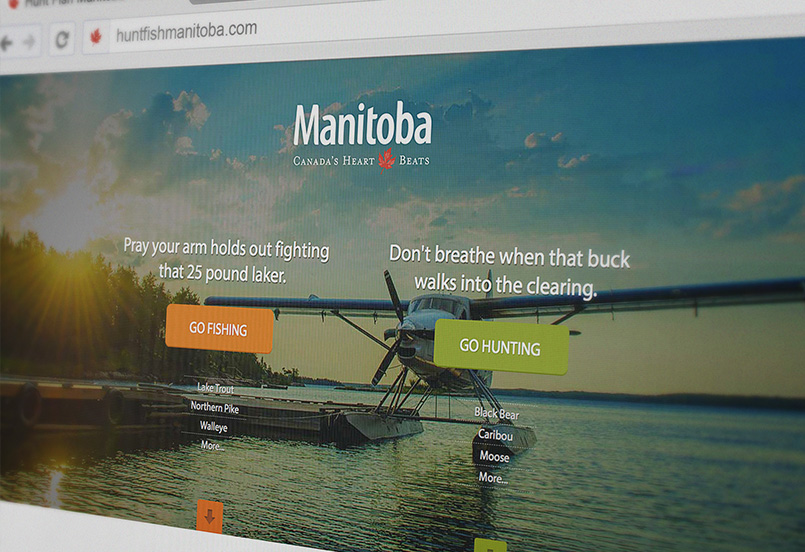
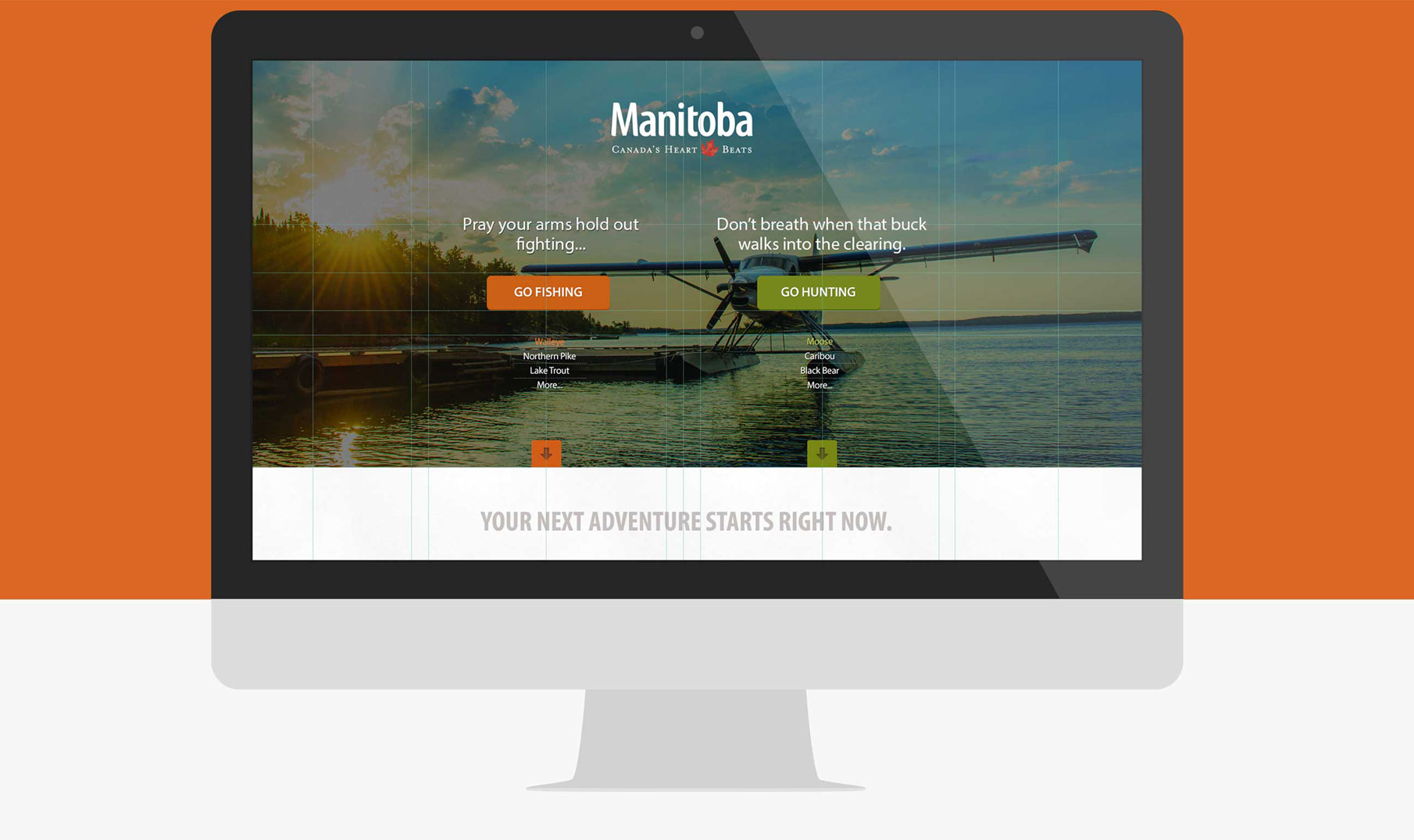
Beyond the search, the site provides a ton of useful information about hunting and fishing in Manitoba, including details on the variety of species, how to plan a trip, and master angler programs. The site also integrates with Double Click for Publishers, allowing fine-grain control over advertising. Finally, as in typical Sagetree style, the site is exceptionally beautiful. Huge photos of nature scenes and texture everywhere, the site is a visual treat.


Beyond the search, the site provides a ton of useful information about hunting and fishing in Manitoba, including details on the variety of species, how to plan a trip, and master angler programs. The site also integrates with Double Click for Publishers, allowing fine-grain control over advertising. Finally, as in typical Sagetree style, the site is exceptionally beautiful. With huge photos of nature scenes and texture everywhere, the site is a visual treat.